Intro to Data Visualization in R

RISE 2026

Let’s warm up

Go to wooclap.com and enter event code RAGON — or scan:

Wooclap QR code and instructions, event code RAGON

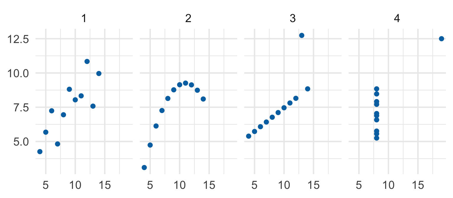
Why make a plot?

Four datasets. Same summary statistics. Very different stories.

A picture shows what a table of numbers hides.

The one big idea

Every row in your table becomes one mark on the plot.

  • geom — the kind of mark and the rule for drawing it
  • mark — what you actually see
  • mapping — links a column to a property of the mark (in aes())

Three words, one plot

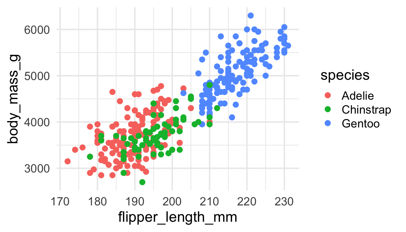
ggplot(penguins, aes(x = flipper_length_mm, y = body_mass_g, color = species)) +
  geom_point()

Mark = dot · Mapping = flipper→x, mass→y, species→colour · one row = one dot.

Anatomy of ggplot()

ggplot(penguins,                    # the data
       aes(x = flipper_length_mm,   # mapping: column -> x
           y = body_mass_g,         # mapping: column -> y
           color = species)) +      # mapping: column -> colour
  geom_point()                      # geom: draw a dot per row

Same data, different geom

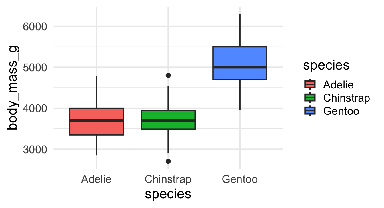
ggplot(penguins, aes(x = species, y = body_mass_g, fill = species)) +
  geom_boxplot()

A box summarises many rows. The mappings still mean the same thing.

Mapping vs. setting

Inside aes() = mapping (from data)

geom_point(aes(color = species))

Outside aes() = setting (one fixed value)

geom_point(color = "navy")

The most common beginner mix-up. Colour from a column vs. one fixed colour.

The pipe: |>

|> means “take this data, then…”

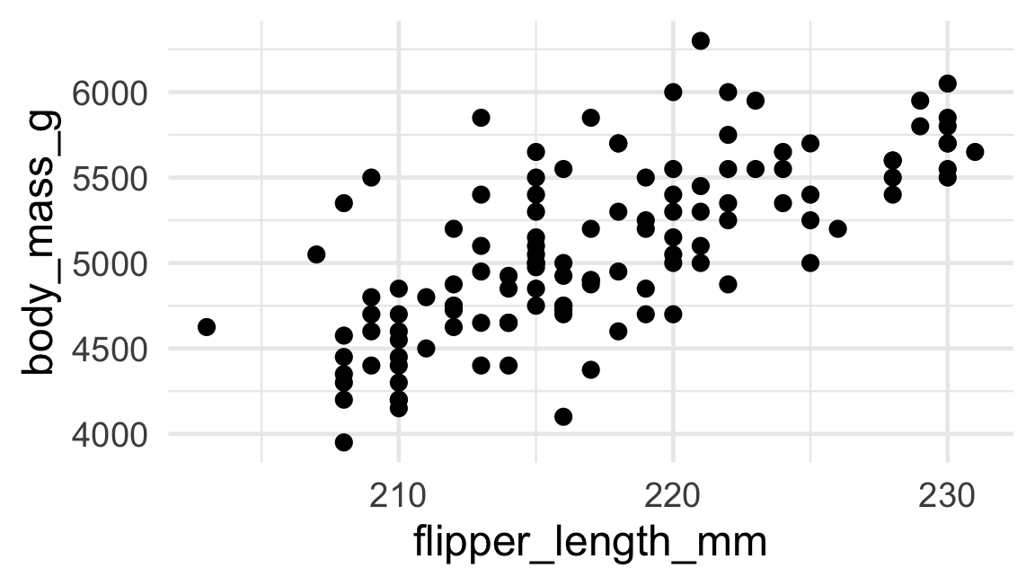
penguins |>
  filter(species == "Gentoo") |>
  ggplot(aes(flipper_length_mm, body_mass_g)) +
  geom_point()

Quick check — before you build

Go to wooclap.com and enter event code RAGON — or scan:

Wooclap QR code and instructions, event code RAGON

Your turn — Exercise 1

Open notebooks/01-visualization.qmd, Exercise 1. For each plot, ask:

  1. What is the mark?
  2. Which column → which property?
  3. How many rows make one mark?

Then build a scatter one line at a time, and swap in a boxplot.

Distributions

What does one variable look like?

One variable, many values

So far every plot compared two things (x vs y).

Sometimes you have just one column of numbers — say, the body mass of every penguin — and you want to see its shape:

  • Where do most values sit?
  • Are they spread out or bunched up?
  • Are there any surprises?

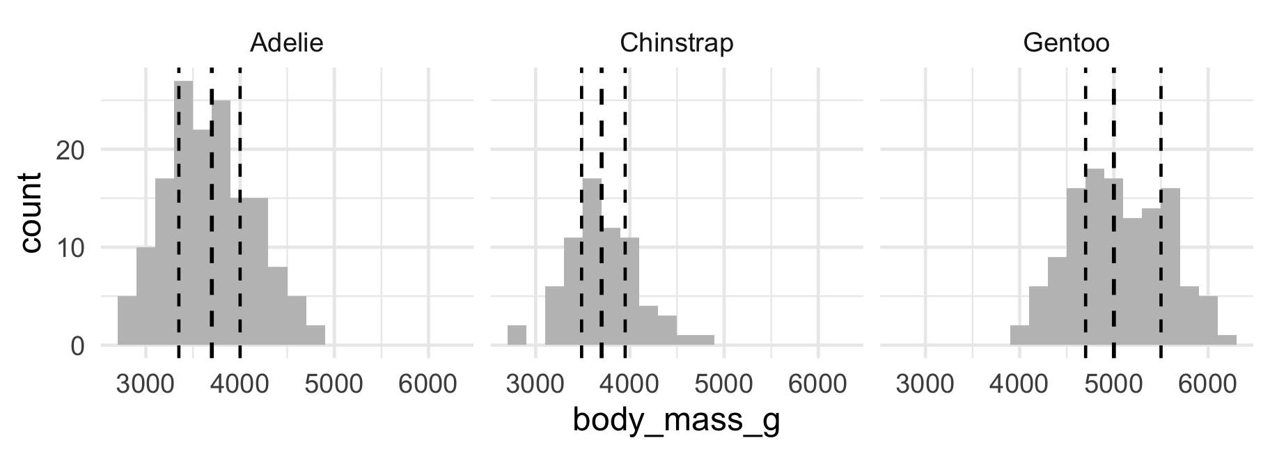
geom_histogram — count rows into bins

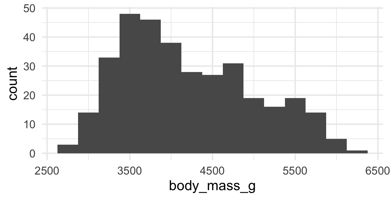
ggplot(penguins, aes(x = body_mass_g)) +
  geom_histogram(binwidth = 250)

Cut the range into bins, then count how many rows fall in each. The bar’s height is a count of rows. (Still: every row lands in exactly one mark.)

A tempting shortcut — just the average

penguins |>
  filter(!is.na(body_mass_g)) |>
  group_by(species) |>
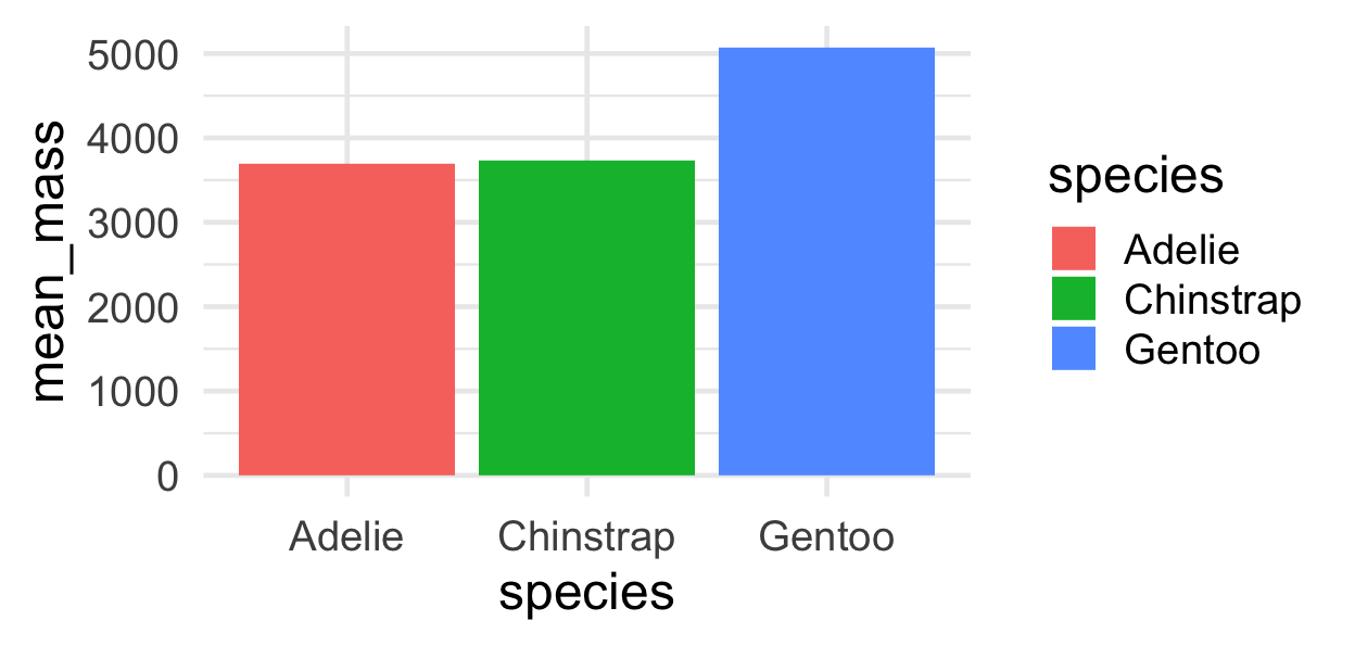
  summarise(mean_mass = mean(body_mass_g)) |>
  ggplot(aes(x = species, y = mean_mass, fill = species)) +
  geom_col()

Don’t do this! One bar per group shows only the mean and throws away the spread, the shape, and every individual penguin.

From a histogram to a boxplot

Each dashed line cuts the distribution: 25% of penguins fall below the first, half below the median, 75% below the third.

The boxplot is a distribution too

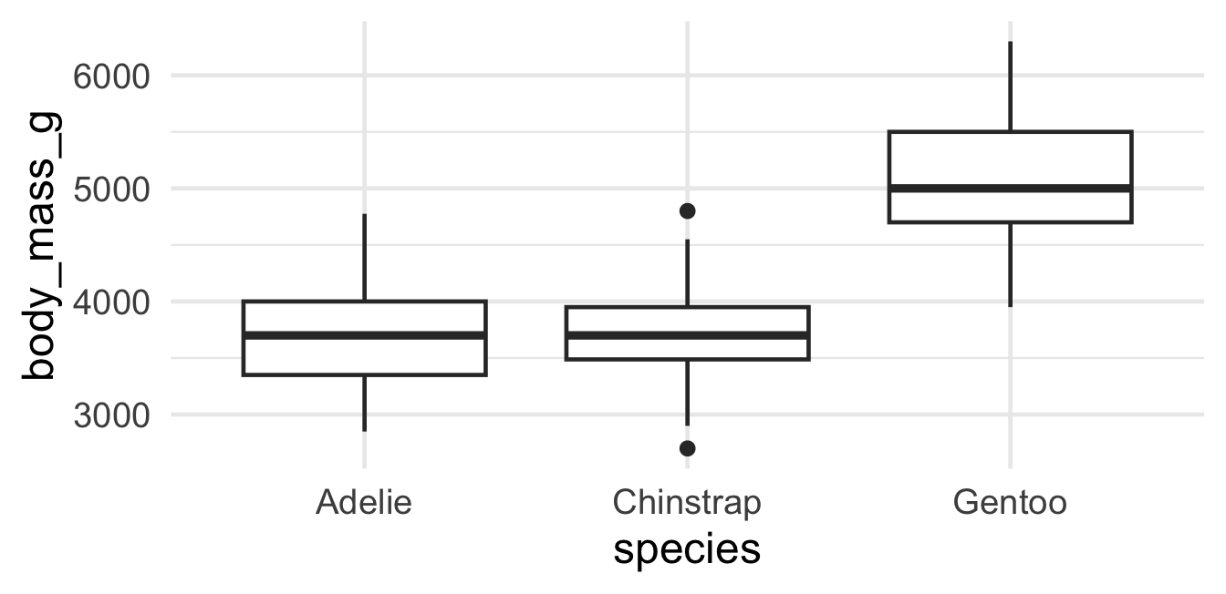
ggplot(penguins, aes(x = species, y = body_mass_g)) +
  geom_boxplot()

A boxplot is just those three cuts drawn as a box: the edges are the 25% and 75% lines, the middle line is the median. One box per group — easy to compare.

Same question, different geoms

  • geom_histogram — the full shape of one distribution
  • geom_boxplot — a compact summary, great for comparing groups
  • Both answer: “what do these numbers look like?”

Your turn — Exercise 2

In notebooks/01-visualization.qmd, Exercise 2:

  1. Make a histogram of flipper_length_mm.
  2. Change the binwidth and watch the shape change.
  3. Make a boxplot of body_mass_g by species.

Quick check — reshaping data

Go to wooclap.com and enter event code RAGON — or scan:

Wooclap QR code and instructions, event code RAGON

Tidy data

Real data rarely arrives plot-ready

Data off a machine

A plate reader gives you one row per sample, with a separate column for each gene it measured:

sample group gene_A gene_B gene_C gene_D
s01 control 102 88 41 59
s02 control 98 91 44 62
s03 control 105 86 39 58
s04 control 100 93 43 61

Four measurements are crammed into one row. This is wide format — easy for the machine, hard for ggplot.

ggplot wants tidy data

The rule: one row = one observation, one column = one variable.

One measurement of one gene in one sample is an observation — so it should be its own row, with a gene column and a signal column.

pivot_longer — from wide to long

plate_long <- plate |>
  pivot_longer(gene_A:gene_D, names_to = "gene", values_to = "signal")
sample group gene signal
s01 control gene_A 102
s01 control gene_B 88
s01 control gene_C 41
s01 control gene_D 59

The gene column names become values in a gene column; the numbers stack into a signal column. Now each row is one measurement.

The payoff: now you can plot it

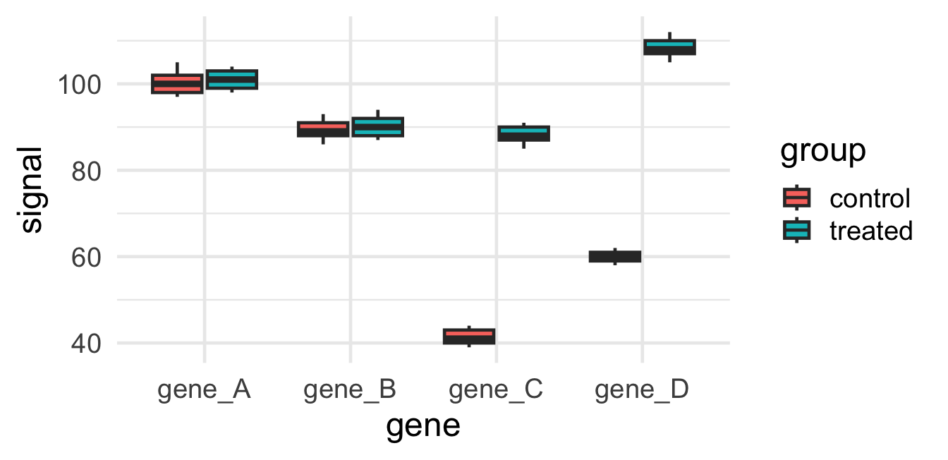
ggplot(plate_long, aes(x = gene, y = signal, fill = group)) +
  geom_boxplot()

Wide data couldn’t make this plot. One pivot_longer unlocked it — and the treatment story (genes C & D switch on) jumps right out.

Your turn — Exercise 3

In notebooks/01-visualization.qmd, Exercise 3:

  1. read_csv() the wide plate file and look at it.
  2. pivot_longer() the gene columns into gene and signal.
  3. Plot signal by gene, filled by group.

What you learned today

  • Every row becomes a mark; the geom draws it; aes() maps columns to properties.
  • Distributions: geom_histogram and geom_boxplot show the shape of numbers.
  • Tidy data: real data often arrives wide; pivot_longer makes it plottable.